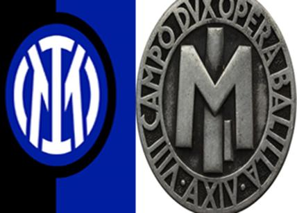
March 30, 2021 the FC Internazionale Milano football club announced it’s new, sleek logo design and launched a campaign aimed to communicate team spirit and unity. For the most part it worked well but one slogan backfired, turning their campaign into an easy target for meme manufacturing by rivals.
The Inter Milano football club has unveiled its new logo which will be used as of the 2021/22 season.
The revamped logo is a sleeker, cleaner design focusing on the I and M and designed by leading graphic design studio Bureau Borsche. Based in Germany, Bureau Borsche is known for working with a range of prestigious clients such as Givenchy Paris, Apple, Penguin Books London and Highsnobiety.
The infamous “Nerazzurri” black and blue colors, chosen March 9, 1908 when the club was founded remain, but with a little more punch and brightening.
Inter Milano states, “The new logo is a modern reinterpretation of the club’s historic symbol, in a more streamlined and minimalist guise. While maintaining continuity with the original version, the new symbol is a more suitable fit for the age of entertainment.”
The original logo had incorporated the FC into the design, whereas the new logo does not feature them at all, leaving it only in the full name and identity of the club, FC Internazionale Milano, shortened to Inter Milano.
The club founded in 1908 has revamped their logo several times throughout their history.

The new, minimalist design was conceptualized to appeal to the digital, social media, generation; immediate and streamlined.
I AM
The campaign features club legends such as Javier Zanetti, Marco Materazzi, Christian Chivu, Maicon, Beppe Bergomi, Nicola Berti, Beppe Baresi and Riccardo Ferri, athletes from other sports such as basketball player Marco Belinelli, cyclist Letizia Paternoster and pro surfer Leonardo Fioravanti as well as personalities like Tedua and actress Matilde Gioli.

Inter reveals, “The expression “I am” is used to directly communicate the values and inclination of the club but also serves as a hook to describe the essence of every Inter fan without any distinction.”
Slogans like “I M READY”, “I M BOLD”, “I M INTER” successfully communicate a message of empowerment and team spirit.

I M AWKWARD

However, the awkward “I M BALLS” has created a stir, (obvious) comments and memes from the online community.
Featured athlete, Marco Bellinelli, NBA player (Golden Gate Warriors, Antonio Spurs) and now MVP for Bologna hasn’t yet published the new campaign images on his Twitter or Instagram accounts. The bright blue socks and black sweat suit show his support for the team, but if I were him, I’d probably be rolling my eyes and wouldn’t have shared it on social media either.
Using “I M BALLS” seems to have been a clumsy attempt to latch on to the slang term which the Urban Dictionary defines as:
Im balls
Basically its just a bad ass way of saying either
(1.) i could really care less
(2.) f*ck off
(3.) or you just say it when you don’t know what to say
(4.) yeah imma bad assPerson 1: hey i just got new shoes u like em?
You: im balls
person 1: hey whats up
You: im balls
person 1: im pregnant
You: im balls
Ironic memes, (created by rival Milanista fans) have also surfaced and are likely to increase:


Critics have also noted that the new Inter Milano logo resembles pins and emblems of the Opera Nazionale Balilla fascist youth organization during the Mussolini reign. The similarities are surprisingly striking.

Celebrities and personalities have praised it and true, die hard fans are ready to get new tatoos. All in all, it seems like the new logo has been accepted but it has also had mixed feelings from some Inter fans. While many fans encourage and support the change, others feel bewildered and betrayed, and have commented:
[source: Twitter]
“What was wrong with your original emblem? What is wrong with tradition?”
“Similar to Juventus. Trying to be too simple and modern is killing the charm the old logos had.”
“That logo does not represent the Milan International Football Club”
“I cannot acknowledge that logo, which is horrible in shape and colors, nor will I buy shirts with that disgrace on them.”
Why did they change the FC Internazionale Milano logo?
In an article about the new Inter Milano rebranding, the Italian sports publication Gazzetta wrote, “The logic behind this initiative, like it or not, is for the market. Managers of football clubs, committed to exploring new and increasingly profitable international markets, are constantly looking for a novelty that stimulates new emerging groups of customers. One of the most used marketing levers is “rebranding”, that is a set of actions with which the managers of a company make changes to the brand in order to reposition the product on the market differentiating it from that of the competition and making it more attractive. In the case of the football sector, the “rebranding” policies concern in particular the changes that can be made to the company name, the club logo, its historical motto or the colors of the game uniform.”
In the end, it was all about the market, getting more and more people to follow a brand and buy merchandise. Loyal fans will buy the new merchandise, as will new fans who want to be part of the tribe.
In my opinion, substance and quality is the only sustainable way to build fan loyalty. In the case of a football team, they need to have strong players and to win games. In Italy, football culture is also part of family heritage. I hardly believe a fan will be persuaded to follow a team because of a new logo design. Perhaps, I M WRONG.
This is an independent blog editorial and not supported or sponsored by any of the above mentioned corporations. All images, names and brands are used in good faith under fair use (uso equo) for informational and editorial purposes.
Discover more from MilanoStyle.com
Subscribe to get the latest posts to your email.
 Ciao, I’m Celia, your travel advisor in Italy! Need a personal shopper in Milan or want help planning your trip to Italy? Learn about what to do and see, and where to eat and sleep. Ask me a question or request a custom travel plan. Book a consultation. Ciao, I’m Celia, your travel advisor in Italy! Need a personal shopper in Milan or want help planning your trip to Italy? Learn about what to do and see, and where to eat and sleep. Ask me a question or request a custom travel plan. Book a consultation. |


